

Camp Quality Identity
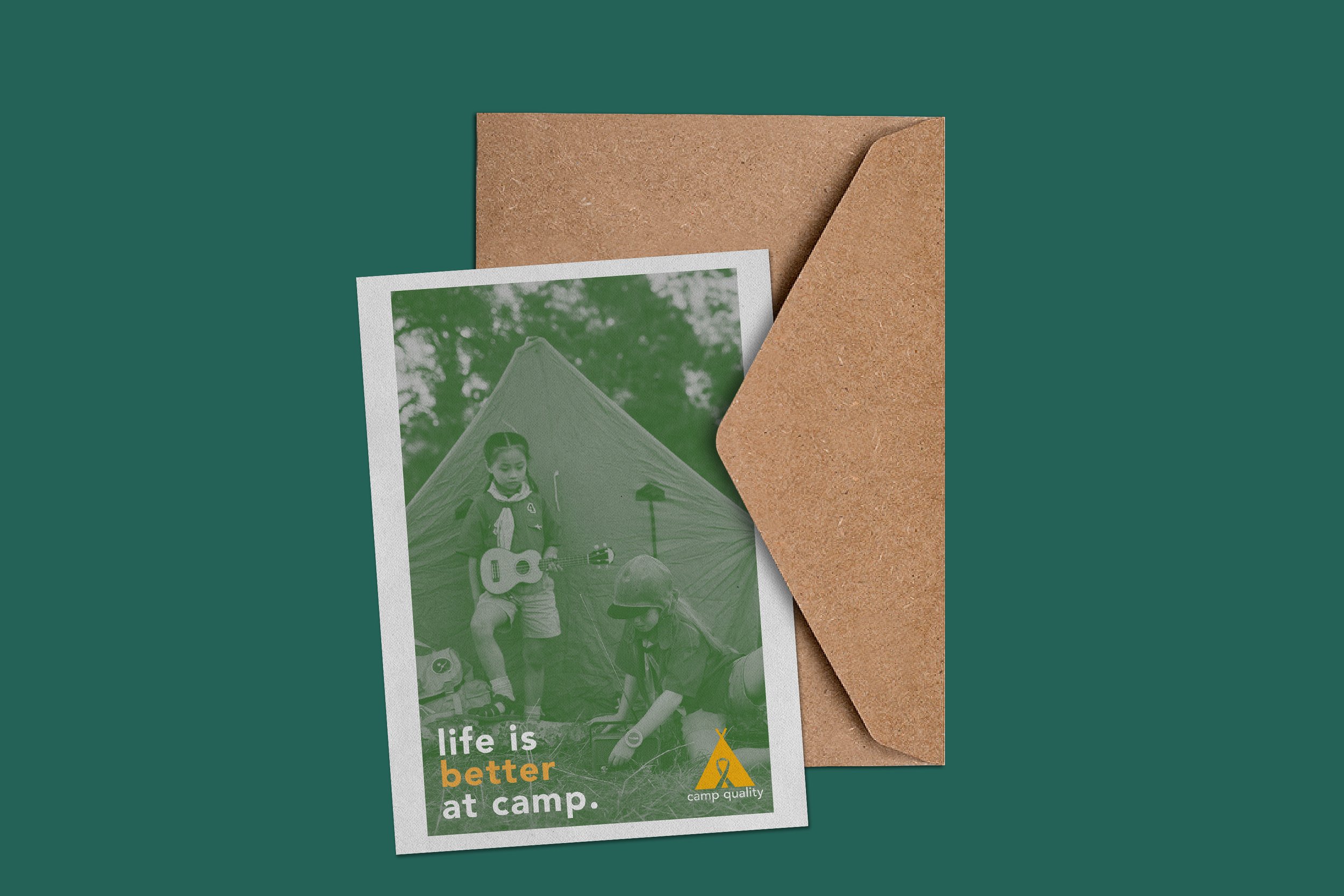
The goal of this project was to find a local company and redo their branding and identity. I chose the charity Camp Quality, which is a camp for children with cancer. I chose the colors yellow and green as they represent nature and summer, which add to the feeling of camp. Redesigning the logo was a fun challenge!


Myers School of Art - Typography 4
Designed by Finn Deetscreek
Photoshop, InDesign
2021